使用CSS控制Android控件的样式--pixate-freestyle-android

###介绍

介绍一个开源项目 pixate-freestyle-android

项目地址:https://github.com/Pixate/pixate-freestyle-android

让我们使用css的形式来控制Android的控件的样式,支持的控件有

  1. View (generic attributes support for all views)
  2. ImageView
  3. TextView
  4. CheckedTextView
  5. Button
  6. CompoundButton
  7. ImageButton
  8. ToggleButton
  9. RadioButton
  10. CheckBox
  11. Spinner
  12. ListView
  13. GridView
  14. EditText (support a non-editing mode)
  15. ActionBar (not in the View’s hierarchy, but almost completely supported)

###使用

1.下载 JAR 包,导入工程
2.创建 default.cssassets
3.初始化:

Activity中:

1
2
3
4
5
6
7
8
9
10
11
12
13
@Override
protected void onCreate(Bundle savedInstanceState) {
super.onCreate(savedInstanceState);

// Set the license (get it for free from www.pixate.com).
// This should be done at least once in the main activity.
Pixate.setLicenseKey("Your License Key", "Your Email");

// Initialize pixate for the Activity
Pixate.init(this);

setContentView(R.layout.main);
}

Fragment中

1
2
3
4
5
6
7
8
9
@Override
protected void onCreate(Bundle savedInstanceState) {
super.onCreate(savedInstanceState);

// Initialize pixate for the Fragment
Pixate.init(getActivity());

setContentView(R.layout.fragment);
}

###为控件设置样式

1
2
3
4
5
// Setting a class for a Button
Pixate.setStyleClass(button, "myButton");

// Setting an ID for a Button
Pixate.setStyleId(button, "myButtonId");
1
2
3
4
5
6
7
<Button
android:id="@+id/myButtonId"
class="myButton"
android:layout_width="match_parent"
android:layout_height="wrap_content"
android:text="@string/myButtonStr"
android:textSize="16sp" />

Button

1
2
3
#button1:pressed {
background-image: url(pressed.svg);
}

这里写图片描述

CheckBox and RadioButton

1
2
3
4
5
6
7
8
9
10
11
12
13
14
15
16
17
18
19
20
21
22
/* Default state (non-checked) */
#bt {
background-image: url(unchecked-bg.svg);
}

/* Checked state */
#bt:checked {
background-image: url(checked-bg.svg);
}
You can also control the check-mark or radio icon itself. To do so, we defined a virtual child named icon for that view:

/* Default, non-checked, icon */
#bt icon {
background-image: url(check-off.svg);
background-size: 60;
}

/* Checked state icon */
#bt icon:checked {
background-image: url(check-on.svg);
background-size: 60;
}

这里写图片描述

ToggleButton

1
2
3
4
5
6
7
8
9
10
11
You can style toggle On and Off states by using the toggle virtual-child:

.toggle toggle:off {
background-image: url(toggle-off.svg);
background-size: 200px;
}

.toggle toggle:on {
background-image: url(toggle-on.svg);
background-size: 200px;
}

这里写图片描述

ImageView and ImageButton

1
The ImageView and the ImageButton have some unique properties that can be styled via CSS.

这里写图片描述

1
2
3
4
5
6
.imageView {
tint: #450022FF;
transform: matrix(0.70710677, -0.70710677, 0.70710677, 0.70710677, 0.0, 200.0);
scale-type: matrix;
background-size: 450px;
}
1
2
3
4
5
6
7
8
9
10
11
12
You can define the image that will be displayed in the ImageView by using the image virtual-child:

.imageView image {
background-image: url(default.svg);
background-size: 300px;
}
And you can easily define a state for that ImageView, making it react to clicking events. An ImageButton already has a pre-defined state for pressed, so setting the pressed state in the CSS will simply overwrite it.

.imageView image:pressed {
background-image: url(pressed.svg);
background-size: 300px;
}

这里写图片描述

ListView

1
2
3
4
5
6
7
8
9
10
11
12
13
14
Styling a ListView consists of of properties that will be applied to the entire list, and properties that will target the list rows. We'll start by showing how to control the list dividers and setting an overscroll paint:
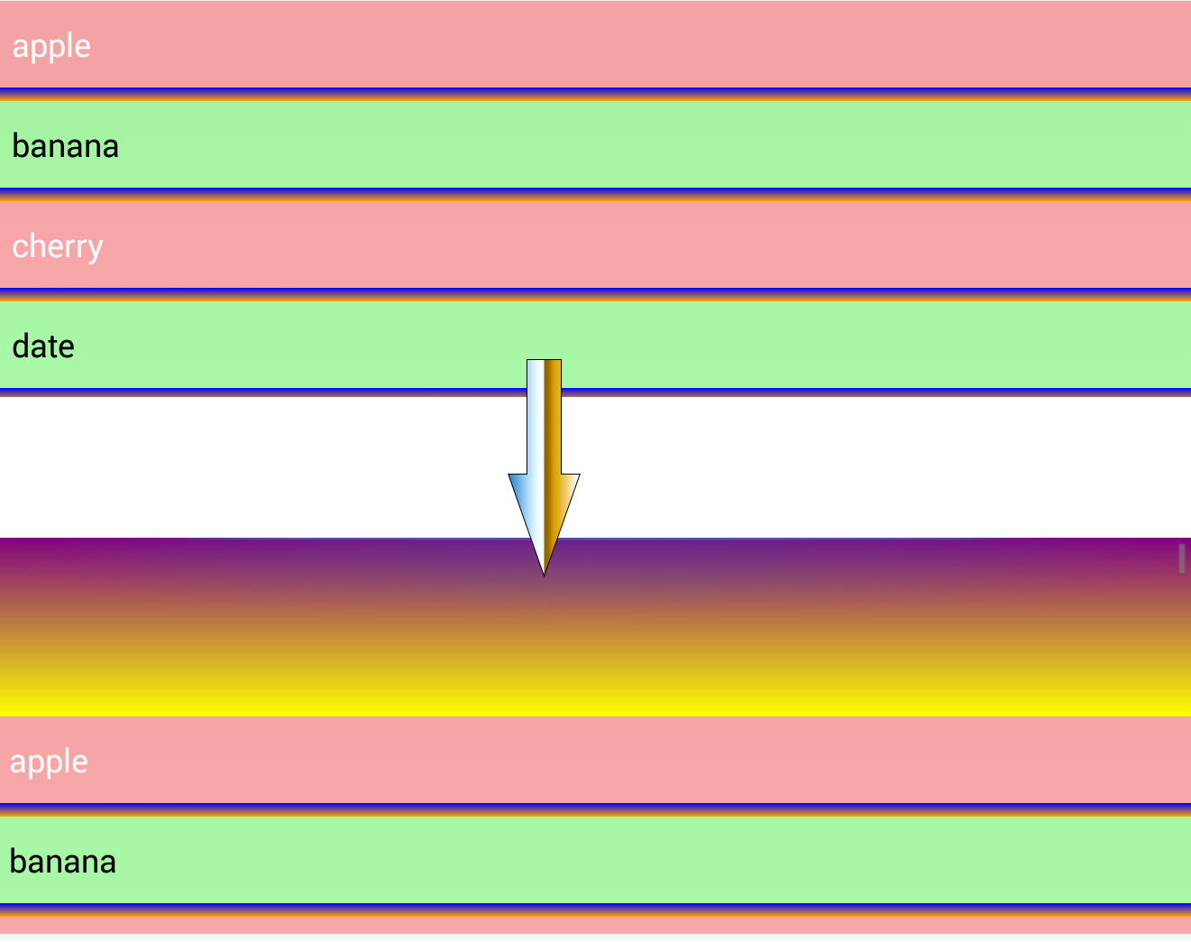
/* set a 5 pixel divider with a gradient color */
.myList {
divider: linear-gradient(black, orange);
divider-height: 5px;
}
/* set the overscroll drawables for the header and the footer */
.myList overscroll {
distance: 200px;
footer: linear-gradient(red, white);
header: url(top-overscroll.png);
}
Note that the overscroll is handled by a virtual child named overscroll. It can accept header, footer and distance values to define the overscroll images and the distance that will be allowed to show them.

这里写图片描述

Nth-Child

1
2
3
4
5
6
7
8
9
10
We can also access and style the nth-child of the list items to paint odd and even rows differently. This is done by using the nth-child pseudo-class.

/* every odd row */
.myList:nth-child(2n+1) {
background-color: #006600;
}
/* every even row */
.myList:nth-child(2n) {
background-color: #FF0000;
}

GridView

1
2
3
4
5
6
7
8
9
10
11
12
13
14
15
16
17
GridView styling includes properties that control column count, width and spacing.

A typical usage would be to simply set the column count and let Android take care of evenly spacing the columns.

.myGridView {
column-count: 4;
}
For finer control, we can set the properties that affect width and spacing:

/* 4 cols, each 180 wide with gap of 50 between, and gap of 50 between rows too. */
.myGridView {
column-count: 4;
column-width: 180;
column-gap: 50;
column-stretch-mode: none; /* 'none' will leave the width as 180. Can also accept spacing, spacing-uniform or column-width */
row-gap: 50;
}

这里写图片描述

更多信息可以去github上查看


JAR包
Demo下载